

7 Steps to a Cohesive Color Palette in a Rental
Quick Summary
A cohesive color palette in a rental comes from building around the finishes you can't change: start with neutral walls, pick one or two accent colors, and repeat them across rooms. Apply a 60-30-10 split so the whole home reads as one scheme.
- Start by noticing fixed anchors like wall color, flooring tones, cabinets and window light.
- Choose a neutral wall base such as warm cream, soft greige or off-white.
- Repeat one accent color across at least three items to make the palette feel deliberate.
- Test samples at home over two to three days in morning, afternoon and night light.
- Use removable hanging strips and leaning displays so decor needs no nails or holes.
Table of Contents
- Why a Cohesive Color Palette Matters More in a Rental
- Start With a Neutral Base for Your Walls
- Apply the 60-30-10 Rule Room by Room
- Coordinate Your Palette With Flooring, Fixtures and Light
- Use Fine Art to Anchor Your Room's Color Scheme
- Add Renter-Friendly Wall Decor That Reinforces Your Colors
- Booking Your Palette Plan: Test, Reverse and Move Out Clean
- Frequently Asked Questions
7 Steps to a Cohesive Color Palette in a Rental
Last Updated: November 5, 2026
Giving the gift of art for the holidays or a celebration is the new cool thing, and it works just as well for your own home. Renters often feel stuck with beige walls and random décor that never quite fits together. A cohesive color palette changes that, and you can build one without painting a single wall. This guide from Magick Brush walks you through the process step by step, so your rental feels calm, intentional, and like your own.
Why a Cohesive Color Palette Matters More in a Rental
When you rent, you cannot control the bones of the space. The walls, floors, and fixtures often come in whatever shade the landlord chose years ago. A strong color palette gives you a way to pull those pieces together with what you bring in.
Here is the core idea: the colors you add should look like they belong with the colors you already have. National Association of Realtors renter survey has reported that many renters want their homes to feel personal, which is why a deliberate palette matters.
Start by noticing what you already live with:
- Wall color and trim
- Flooring tones (wood, tile, or carpet)
- Fixed fixtures like cabinets and countertops
- Window light, which changes how every color looks
Once you see those anchors, every new item becomes a choice instead of a guess.
Start With a Neutral Base for Your Walls
Your walls are the largest surface you see every day, so they set the foundation. Choose a neutral base such as warm cream, soft greige, or an off-white with a touch of warmth. Neutral walls let your accent colors stand out without fighting each other.
Many renters find that a neutral base is the safest starting point. It also makes it easier to move furniture or swap décor later without the room looking mismatched.
Watch out: a cool white can make warm wood floors look orange, so test your paint next to your flooring before you commit.
Apply the 60-30-10 Rule Room by Room
The 60-30-10 rule is a simple way to balance color, but in a rental it works best as a repeatable workflow rather than a one-room trick. Use it to carry a palette from your entryway through shared spaces and into bedrooms, so the whole home reads as one intentional scheme instead of a series of disconnected rooms.
Here is the rental-friendly workflow:
- Start at the entryway. The first space you see sets the tone. Treat the wall color (or the dominant wall decor) as your 60%, the flooring or a runner as your 30%, and a small accent (a tray, a hook, a frame) as your 10%. Keep this palette simple because it will repeat.
- Carry the same 60% into shared spaces. In an open-plan living and dining area, let the dominant wall or large rug hold the 60%, use the sofa or dining chairs as the 30%, and repeat the entryway accent in pillows, a vase, or a piece of art as the 10%. Repeating one accent color across at least three items is what makes the palette feel deliberate.
- Shift the ratio, not the colors, in bedrooms. Bedrooms can invert the rule: let bedding or a large textile hold the 60%, walls or curtains the 30%, and a small accent the 10%. Keeping the same color family while changing the ratio gives each room its own mood without breaking cohesion.
- Use smaller rooms as accent rooms. A bathroom or hallway can lean harder on the 10% accent, a bold towel, a patterned shower curtain, a small print, because you spend less time there and can afford more visual energy.
A living room might use cream walls (60%), a sage green sofa (30%), and terracotta pillows (10%). The adjacent dining area then repeats cream, sage, and terracotta in a rug, chairs, and a centerpiece. The bedroom keeps sage and terracotta but lets a quilted coverlet carry the dominant share.
Watch out: if every room uses a different accent color, the home will feel like separate showrooms rather than one palette. Pick one or two accents and repeat them.
Here is how the 60-30-10 split works in each part of a rental, using the same colors throughout.
| Room | 60% (dominant) | 30% (secondary) | 10% (accent) |
|---|---|---|---|
| Entryway | Wall color or dominant wall decor | Flooring or a runner | Small accent such as a tray, hook or frame |
| Living and dining | Dominant wall or large rug | Sofa or dining chairs | Pillows, vase or art repeating the entryway accent |
| Bedroom | Bedding or large textile | Walls or curtains | Small accent in the same color family |
| Bathroom or hallway | Existing finishes | Textiles | Bold towel, patterned curtain or small print |
Coordinate Your Palette With Flooring, Fixtures and Light
Your fixed finishes and your lighting shape how your palette looks in real life. Before you buy anything, bring a fabric or paint sample next to your floor and check it in morning light and evening light.
Here is a simple checklist:
- Compare each new color against your floor tone
- Check how colors look under warm lamps and daylight
- Note the metal finishes you already have (brass, chrome, or black)
- Pick accents that repeat at least one of those tones
Keep this approach practical. Testing takes a few minutes and can save you from buying the wrong shade twice.
Use Fine Art to Anchor Your Room's Color Scheme
Art is one of the easiest ways to bring a palette together, because a single piece can hold several of your colors at once. Pick a print that already contains your accent shades and let the rest of the room build around it. If you are unsure how to judge whether a piece fits your scheme, choosing art that feels authentic walks you through what to look for.
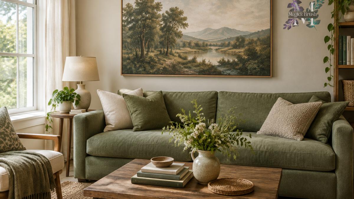
Magick Brush creates fine-art nature photography designed to calm and anchor a space. The Green Passage is a landscape print with soft greens and natural tones, which makes it a natural fit for a neutral room with sage or moss accents. It is available as a fine art print or an aluminum Dibond print, priced at $149.99.

For a larger statement, Quiet Abundance at $189.99 uses botanical tones that can tie together warm neutrals and green accents.

Add Renter-Friendly Wall Decor That Reinforces Your Colors
You do not need to damage walls to hang art. Use removable hanging strips, leaning displays on a shelf, or a gallery grid held by a rail system. For step-by-step ways to display framed photography without nails or holes, see how to display photography in rentals without damaging walls. Choose frames and mats in colors that repeat your palette. For more ideas on styling a rented apartment so the decor reinforces your palette, see intentional decor for rented apartments.
Apartment Therapy guide to renter-friendly décor offers useful ideas for hanging pieces without tools. You can also apply the same approach to smaller pieces, such as Written in Green at $139.99, which adds a fresh botanical accent to a hallway or office.

Practical tips for renters:
- Use picture-hanging strips rated for the frame weight
- Lean larger prints on a console to avoid holes
- Repeat one accent color across at least three items
Booking Your Palette Plan: Test, Reverse and Move Out Clean
Before you commit to any color, test it in the actual conditions of your rental. Rental lighting and fixed finishes are the two things most likely to make a palette look wrong after you bring it home, so build a short testing routine.
Test colors in real rental lighting. Window direction, time of day, bulbs, and existing finishes all change how a color reads. A north-facing room tends to cast cool, blue-ish light, while a south-facing room runs warm and bright. Use this sampling method:
- Tape a large sample board (at least 8 by 10 inches) to the wall and leave it for two to three days.
- Check it in morning light, afternoon light, and at night under the lamps you actually use.
- Note the bulb type: warm-white bulbs (around 2700K) make colors look softer and yellower, while cooler bulbs (around 4000K) make them look crisper and bluer.
- Hold fabric, paint, and flooring samples together, not separately, so you see the real combination.
Work around fixed finishes you cannot change. Dated tile, countertops, cabinets, and flooring are common rental anchors. Rather than fight them, repeat one of their undertones in your textiles and art. If the countertop has a warm beige vein, pull that beige into a runner or a frame mat. If the flooring is orange-toned wood, avoid cool gray accents that make it look redder, and lean toward warm neutrals and greens.
Plan for reversibility and move-out. Confirm your lease rules on painting and hanging hardware before you buy anything. Keep a record of the original wall color and any paint codes, and choose decor you can take with you. A palette built from textiles, art, and accessories is easier to reverse than one built on paint.
Watch out: testing a color only under store lighting is the most common way renters end up with a shade that looks wrong at home. Always bring the sample into the room before you commit.
Frequently Asked Questions
How do you make a rental look cohesive with limited options?
Start with a neutral base such as off-white or warm cream on the walls, since these are easy to live with and rarely clash with existing finishes. Then pick two or three colors from your largest existing elements, like a sofa or rug, and repeat them in smaller pieces around the room. Textiles, cushions and framed art are fully portable, so they let you build the palette without changing anything permanent. Keeping accessories within the same family of tones makes the whole space read as one scheme.
Can you paint rental walls to match your color palette?
Check your lease before painting, because many landlords require written permission and some require you to restore the original color at move-out. If painting is allowed, ask for the approved paint and finish, and test a sample patch first. If painting is not allowed, use the palette through removable options such as art, curtains and throws. Keep receipts and photos of the original walls so you can document the condition when you leave.
What are the best neutral paint colors for rental properties?
Warm whites, soft creams, and light greige tones are the most common choices because they suit most flooring and furniture and make small rooms feel open. Ashen grey and muted sage also work well as calm backdrops. Before choosing, view a large sample on the wall at different times of day, since north-facing rooms look cooler and south-facing rooms look warmer. Stick with one neutral across the main living areas so the eye moves smoothly from room to room.
How can I add color to a rental without permanent changes?
Use removable elements that carry your accent colors. Peel-and-stick wallpaper, tension rods with curtains, rugs, throw pillows and framed art on picture-hanging strips all add color without damage. Choose one accent hue and repeat it in at least three places in the room so it looks intentional. Art is especially effective because a single large piece can set the tone for the whole space.
